You can put patchwork together in any palette you like. My favourite colour groups are drawn from the things I see and the places I’ve been.
-

Alhambra
The colours of the wall tiles all over the Moorish palace at Granada
-

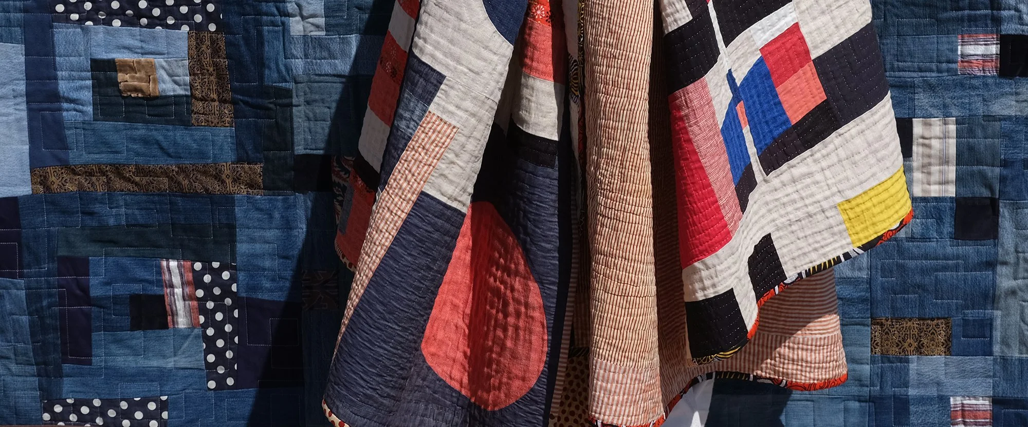
Wassily
A Bauhaus master insisted on the intrinsic roundness of red, squareness of blue and triangularity of yellow. Whatever the shape, it’s hard to go wrong with three primary colours.
-

Kuba
The colours of traditional Congolese raffia appliqué, plus – sometimes – an accent colour that pops.
-

Tricolor
In my version the blue is indigo like denim or chambray and the red can stray to orange or pink.
-

Napoli
The palette of a Pompeiian villa – ochre, red and a greyish blue – all over the streets of Naples today.
-

Dunkin
Red and white quilts are very traditional; in my version the red can stray to orange or pink.
-

Blanc de Blancs
Whites vegetable and mineral: laundry, flowers, paper and the pebbles on a beach in Greece.
-

Sea Glass
Inspired by the sea glass mosaics (green, brown & blue bottle shards) installed beneath the promenade at St Leonards-on-Sea.
-

Citron
Dandelion, possett, sulphur, ochre and other yellows, keeping the rest neutral.
-

Verdigris
The matchless, natural combination of green, blue and brown when bronze, brass or copper get weathered.
-

Pride
A trip to San Francisco prompted my mellowed, Haight-Ashbury rainbow.
-

Carnival
Fairground carousel, gypsy caravan and Pakistani painted truck art blending with Comedia del Arte.